
CLAY: FIRST LOVE BRANDING
Branding / Creative Direction / Production Design
Meet CLAY
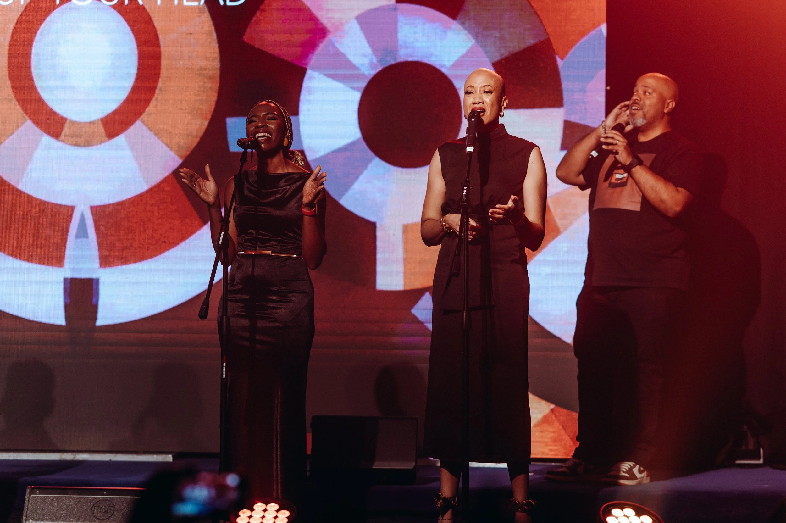
CLAY is a Christian music group based in the DMV area, making their debut with Love’s Song, a compilation of songs that blend jazzy instrumentation with rich vocal harmonies. Inspired by legendary vocal ensembles like Take 6 and Special Blend, the album delivers a fresh, soulful sound wrapped in meticulously crafted rhythms and production.
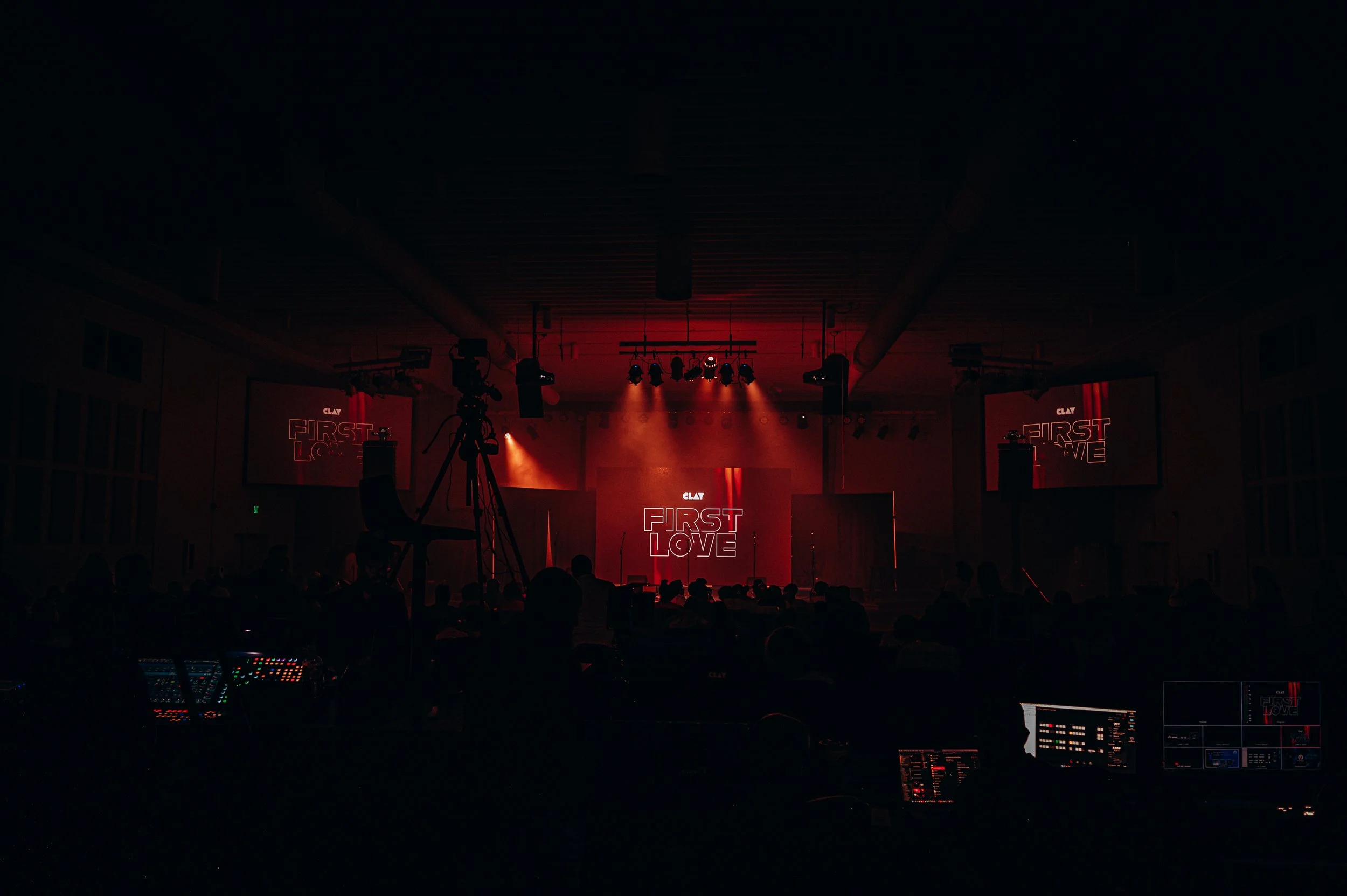
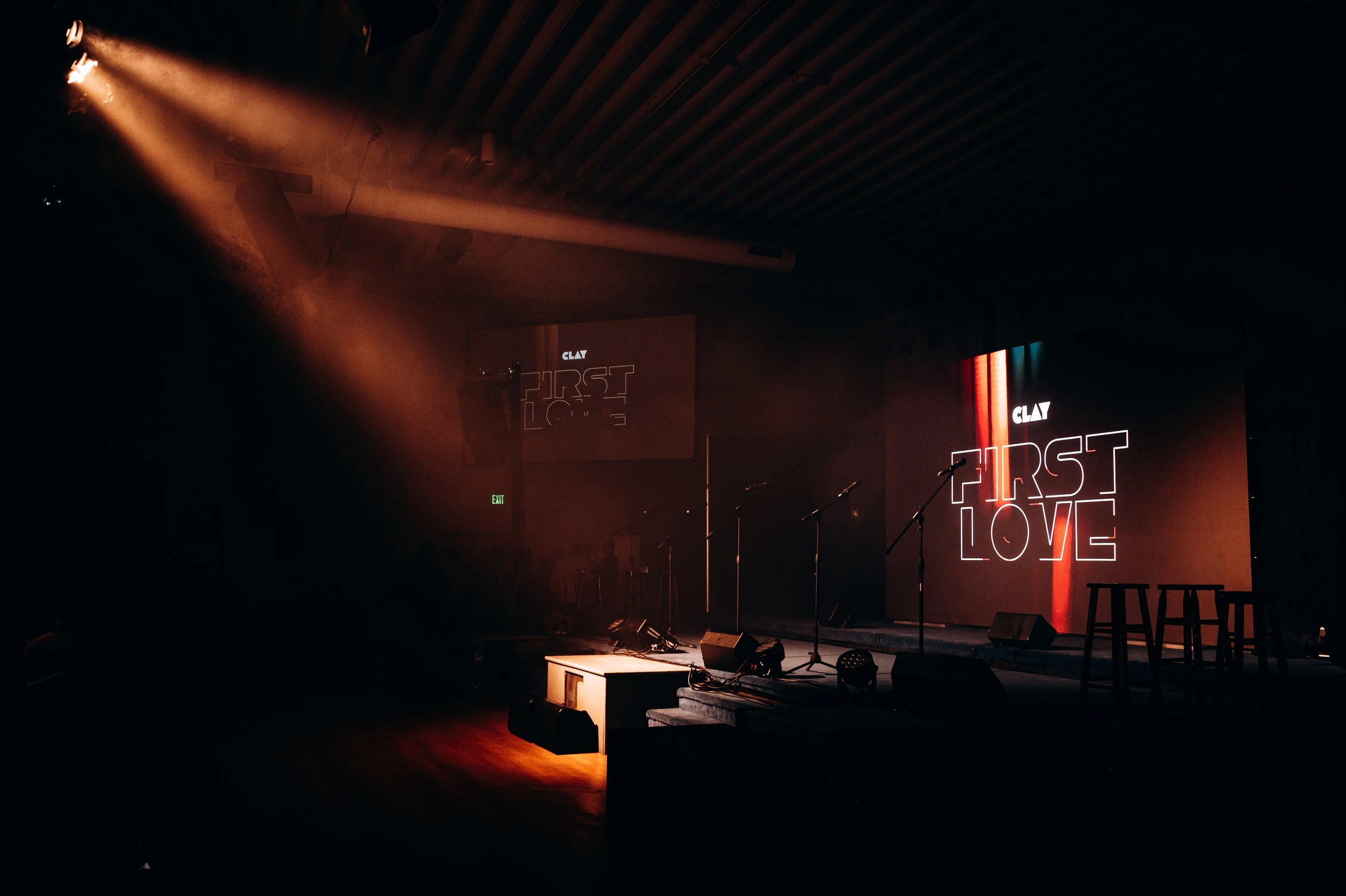
As part of their launch, the group sought a cohesive brand identity and visual presence that reflected their musical ethos while creating an engaging experience for fans, both digitally and in person. I was brought on to provide creative direction for their branding, design their album artwork, and oversee the visuals and production for their album launch concert.
Setting the Stage
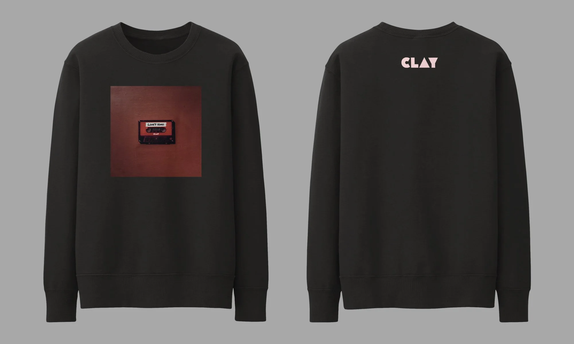
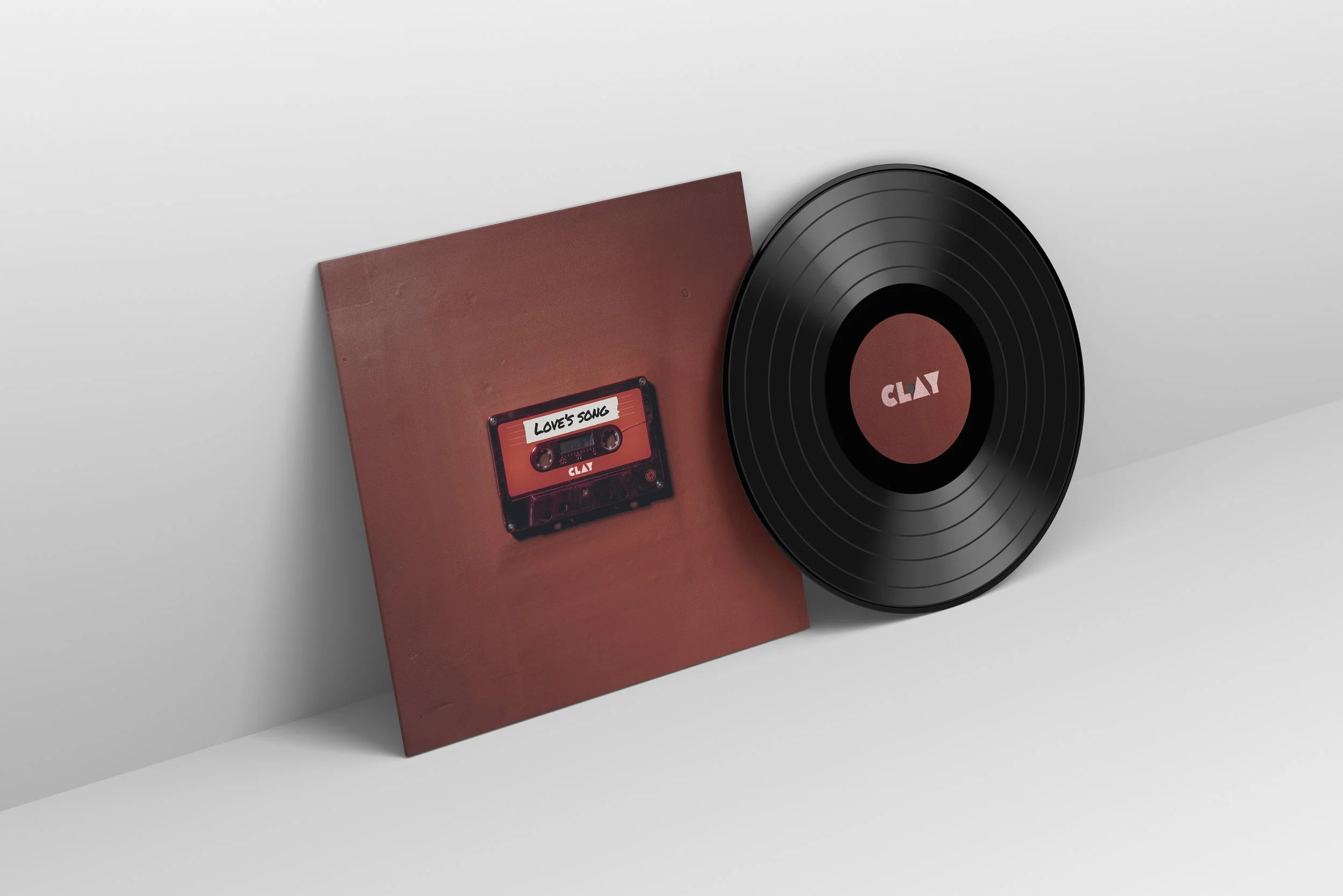
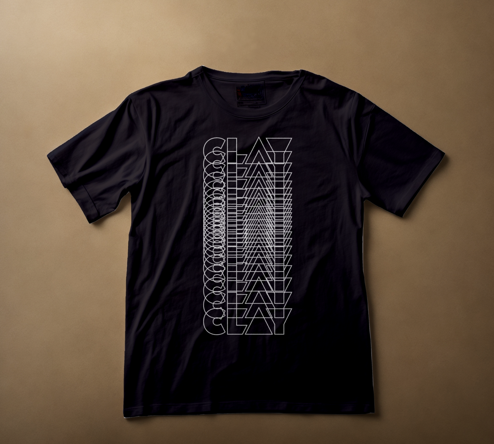
As a debut group, CLAY needed a visual identity that captured the warmth, sophistication, and nostalgic charm of their jazzy, harmony-driven music while working across album artwork, live visuals, and merchandise. The goal was to create a cohesive brand that translated the emotional depth of their songs into visuals and experiences that would resonate with fans. At the heart of this vision was the theme of discovery through nostalgia, embodied by the cassette tape, which offered a tactile, engaging way to connect audiences to the music and make their debut feel fresh and memorable.


Crafting the Vision
The first step was developing the group’s visual identity. I worked closely with the members of CLAY to define a minimalist design language that could flex across different applications, from album artwork to stage visuals. The concept of discovery through nostalgia became a central pillar, influencing our choices of color, typography, and visual motifs. This theme of warmth and familiarity, inspired by the cassette tape, allowed us to craft visuals that felt intimate yet modern.
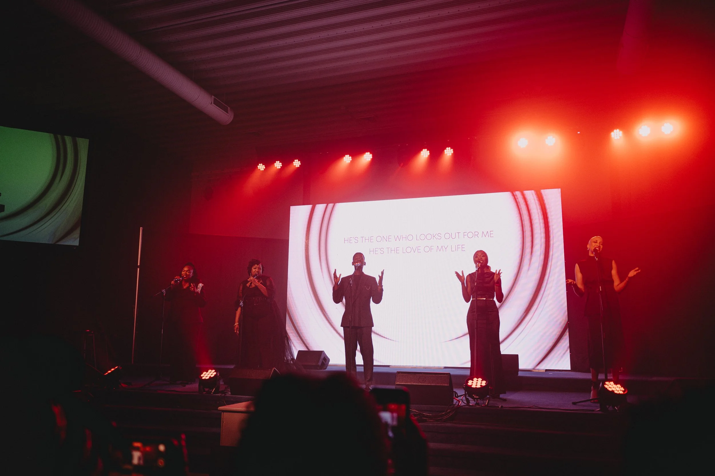
Next, I applied this identity to the album itself, designing artwork that reflected both the musicality and the nostalgic undertone of the project. Motion graphics followed, with an intro video to set the tone of the concert and interlude videos to appear between performances. Each song received its own unique visual theme, guided by the overarching aesthetic, ensuring that the audience was transported into the mood and story of the music.
Finally, merchandise development tied the brand together in a tangible way. T-shirts, keychains, posters, and the cassette tape itself were designed to carry the album’s personality into the hands of fans. The playable cassette tape became a central symbol of the album’s theme, providing a physical, collectible experience that mirrored the emotional resonance of the music. Across all touchpoints—album design, live visuals, and merchandise—the cassette-inspired theme created a cohesive, immersive narrative for the debut of CLAY.


VISUAL ASSETS


Looking Back
Working on Love’s Song reinforced the power of concept-driven design. By embedding the feeling of nostalgia and discovery into every aspect of the project, from visuals to merchandise, CLAY was able to launch with a debut that felt both fresh and emotionally resonant. Minimalist design, when paired with thoughtful thematic storytelling, proved flexible enough to adapt to album artwork, concert visuals, and physical merchandise, creating a unified brand experience that engaged fans on multiple levels.
Team Credit
Rondel Charles: Creative Direction, Brand Strategy, Videography, Styling
Jerome Frederick: Motion Design
Colville Heskey: Photography